We designed and developed the new site for an exciting B2B manufacturer of packaging machines that print labels directly on the package.
Overview
PouchMark is an innovative manufacturer in the labeling and packaging space. Their unique approach makes it possible for companies to package and label their products with a streamlined and creative tool.
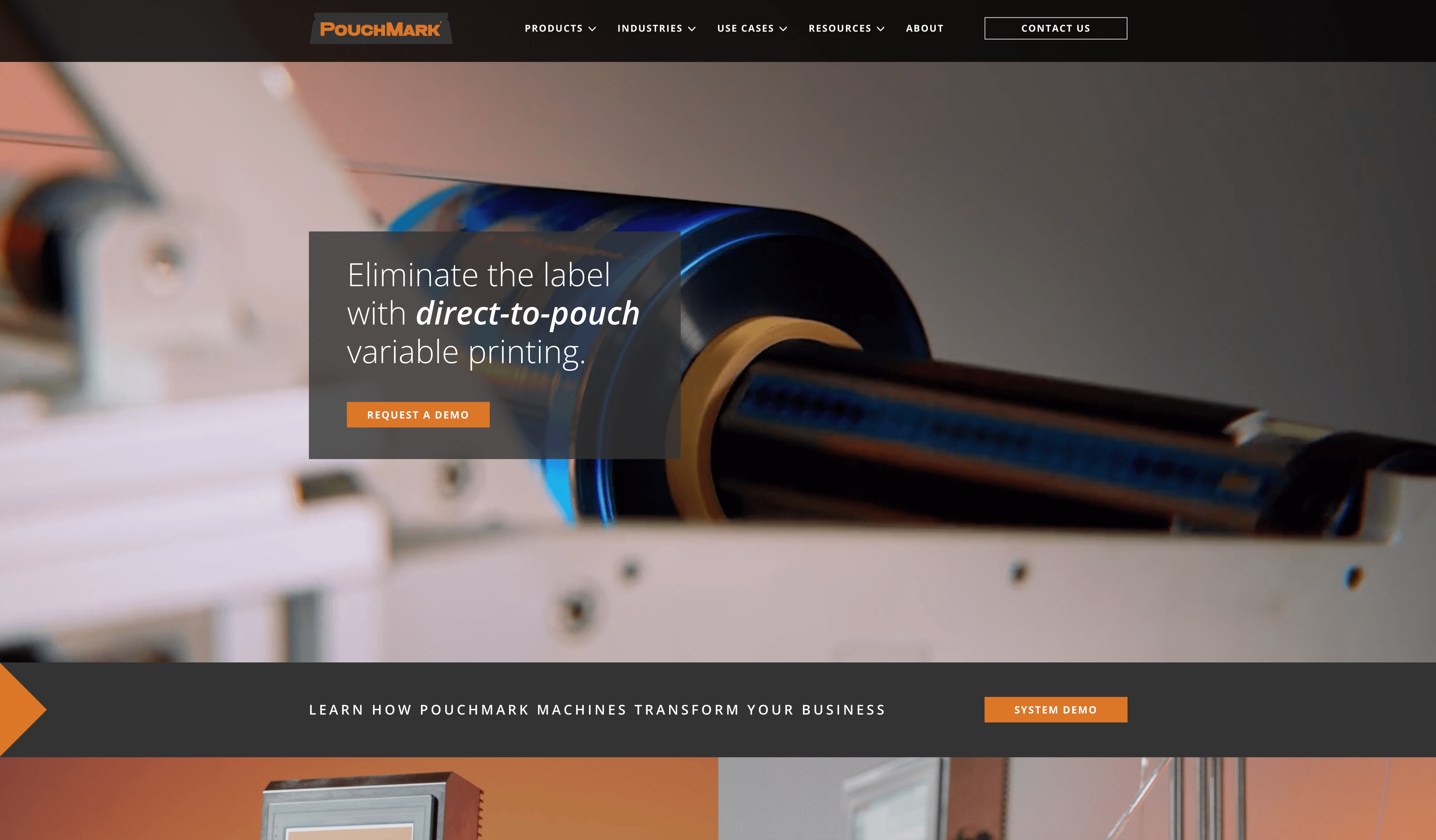
Because of the technical and innovative nature of their business, we wanted visitors to the site to experience their powerful products directly. So we made a site that makes liberal use of videos and photos to give visitors a first-hand experience of the products.
Key Aspects
Video-Forward
When you see a PouchMark machine in action, you are captivated by the cutting-edge technology, the smooth and fast production, and the easy interface. In discussion with the client, we decided that high-quality videos that show their innovative machines in mouth-watering detail would be a central aspect of the site. We designed the site around these videos, with a hero-video auto-playing on landing.

Photos and Videos on Hover
Not only did we want a video to play on landing, but we wanted visitors to know that they could have instant video introductions to the entire line of products. So we built an auto-play-on-hover feature for the entire product line on the home page. When a visitor’s mouse hovers over one of the machines in the product line, a silent video plays automatically. Further, many sections of the website are hover-enabled, with photos changing and videos playing in the background as the visitor navigates the site, giving a dynamic experience of the products. We did all this without sacrificing site speed.
Information Hierarchy & Strong Font Design
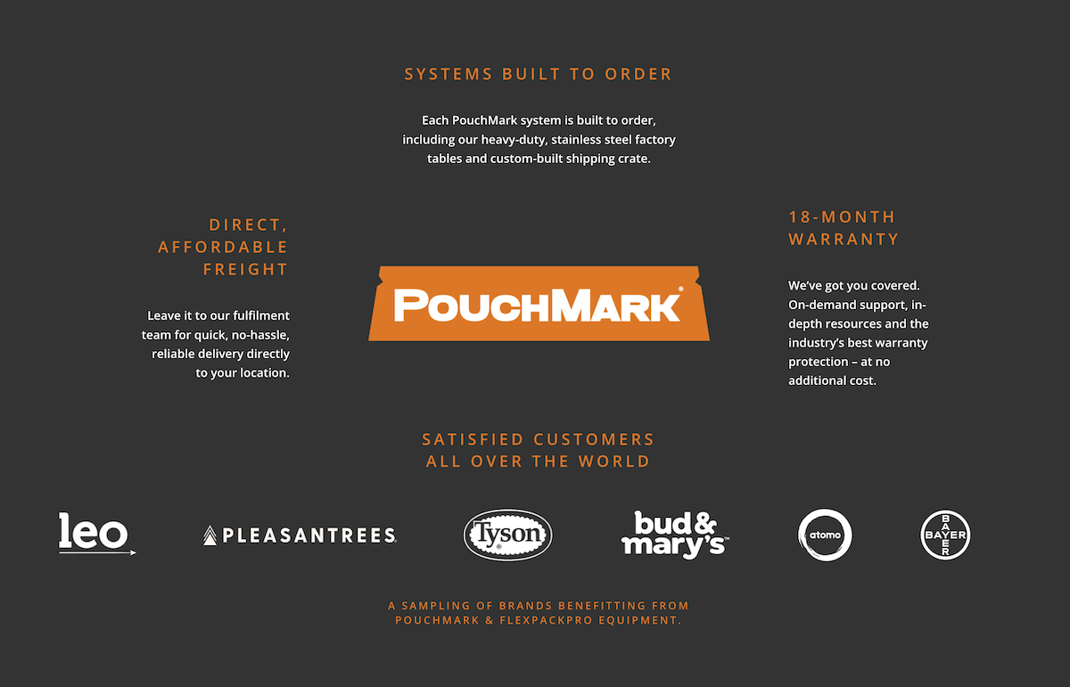
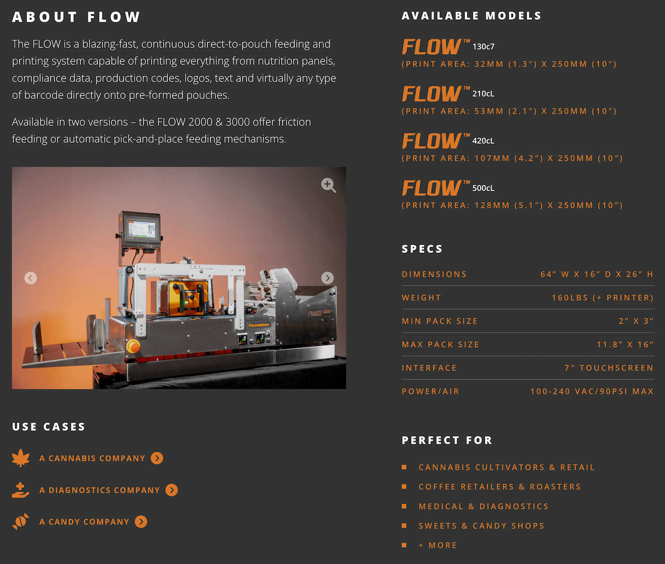
PouchMark’s unique B2B business offering sits between the stolid nature of industrial design and the flexibility of start-up culture. So we wanted the site to be as easily accessible to technicians looking for specs as it is to start-up CEOs dipping their toes into packaging systems for the first time. We spent a lot of time organizing the information they provided to make it both solidly industrial and creatively accessible, using fonts and headings to draw users through a coherent product experience.

Go with Millennial Web Development. Jim is a punctual, creative and action-oriented web developer and project manager with a highly skilled team behind him. They’ve created a website that has brought our company/brand to the next level, and we couldn’t be happier. 5/5 stars.


Back End
Approach
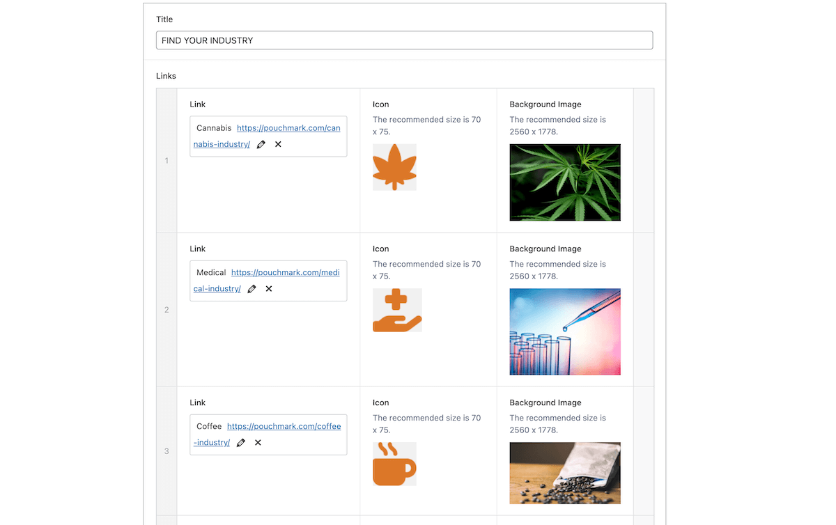
On the backend, we knew that a user-friendly wordpress site would be best, because PouchMark is definitely a business that will be growing in the next few years. Even with all the animation and hover effects, we kept all pages easily editable by the company. All pages can be enhanced after launch and scaled to house more content without involving a developer. We also made it possible for them to easily add content using pre-designed blocks, including articles, new pages, and new products.
Read more about how we create customizable WordPress sites here.Takeaways
With cutting-edge, impressive products to show off, we wanted users to dive right into an experience of the product, and then make their way through the details in a coherent and captivating way. We used videos and photos on hover to keep users captivated while they learn about a game-changing B2B packaging tool.


