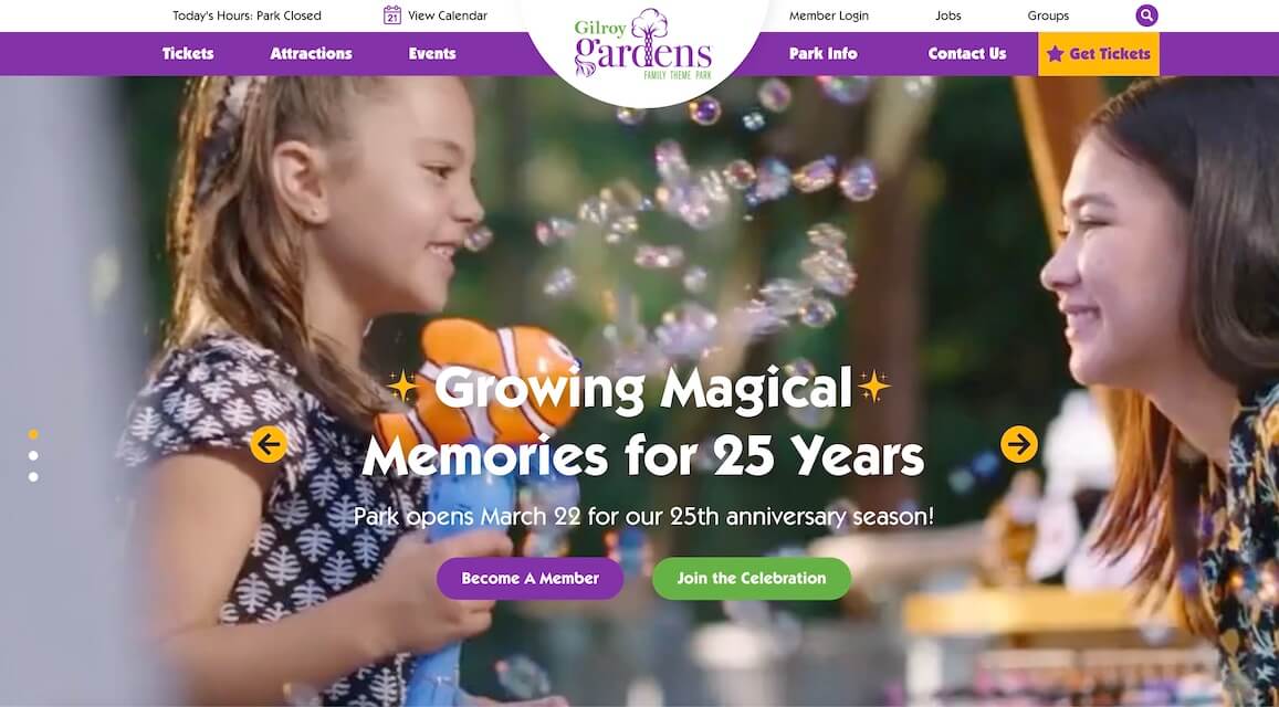
We developed a website for Gilroy Gardens, a tree-themed amusement park in Gilroy, California. Using a custom WordPress theme, we were able to build a highly interactive and informative site, while keeping things lightning fast. Lottie animations and interactive features make this site a breeze to navigate – almost as fun as going to the park itself!
Our Portfolio
Conversion oriented UX, pixel perfect UI & clean front end code.



SRSD
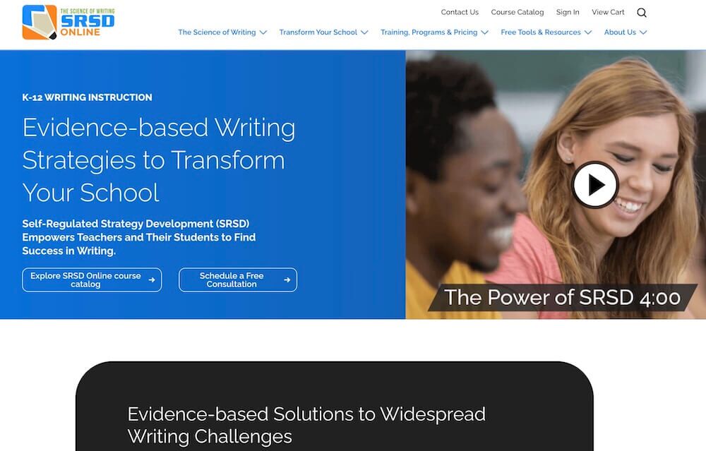
We designed and developed a website for SRSD Online, one of the most exciting organizations in K-12 writing instruction. Their evidence-based writing method is backed by extensive research that they wanted to make accessible through the site. We worked with them to create a site that makes a compelling case for their method while also giving researchers an easy-to-navigate database.


Inspectiv
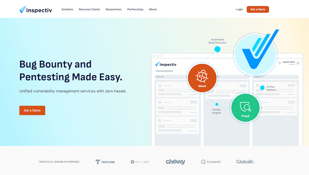
We developed the Inspectiv site on Hubspot and we’re proud of how it turned out. A robust site full of subtle animations, intuitive resource navigation, and clear information hierarchies, the Inspectiv site offers users a dynamic experience with one of the leading SaaS security companies in the world. We were especially happy with the multi-level filtering that we added to the resources page, enabling clear and quick access to a wide variety of informational resources.


Eutelsat America
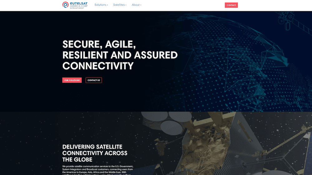
While designing and developing the new website for Eutelsat – a company that provides satellite connectivity for over 274 million homes across Europe, the Middle East, and Africa – we knew that we needed the site to project institutional strength and confidence to appeal to its governmental clients. Our site is heavy on inspiring satellite imagery and is organized to give users fast and intuitive ways of navigating their different service offerings.


PouchMark
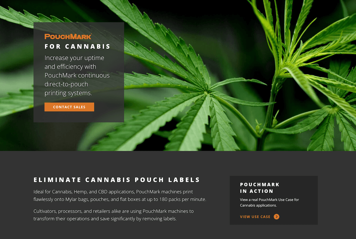
When PouchMark approached us to design and develop their new site, we were happy to see a company doing something new, filling an important niche in the world of labeling and shipping products. We created a site full of hover-enabled videos and photos, illustrating their cutting-edge products as soon as you arrive on the site, and we made sure to keep it all lightning-quick for visitors. The result is a lush and informative journey into their B2B packaging product offering.


Labkey
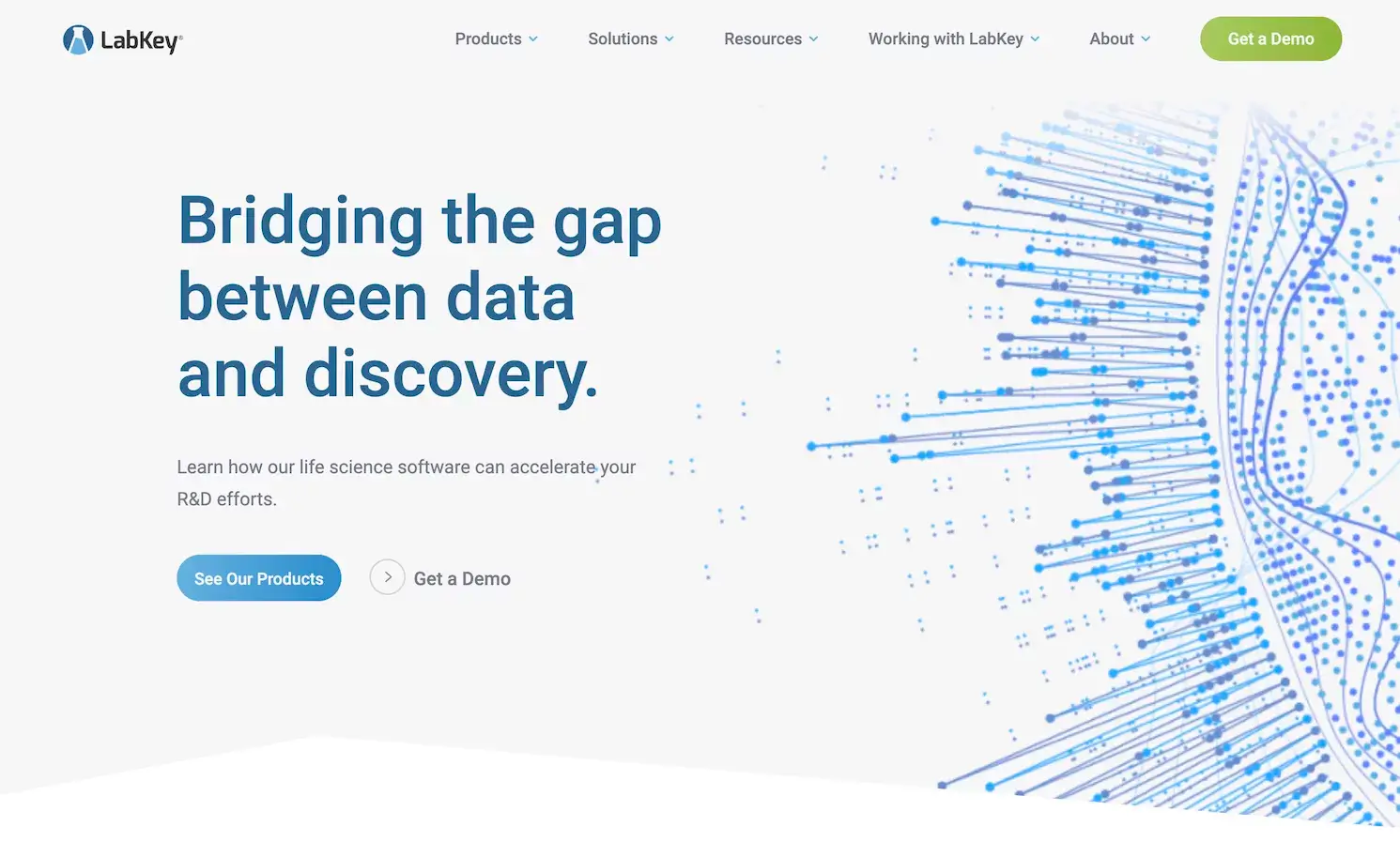
We designed and developed the new website for LabKey, a company that creates leading software for life science labs. The challenge on this site was taking a massive amount of highly-detailed content and distilling it in visually-compelling ways for the web. The process took about 4 months and resulted in a site that stakeholders have reported far exceeds their expectations.


Peterson Wealth
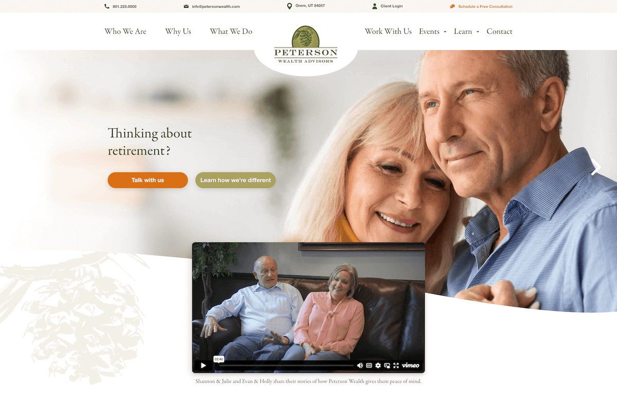
We designed and developed the website for Peterson Wealth Advisors, a retirement planning firm based in Utah. For their new site, they needed to better focus on their target audience – adults 50 to 65 in the early stages of retirement planning. They wanted to feature valuable, well-organized and interactive information that would make their quality case directly on the site. We also needed to design it with the needs of older adults in mind.

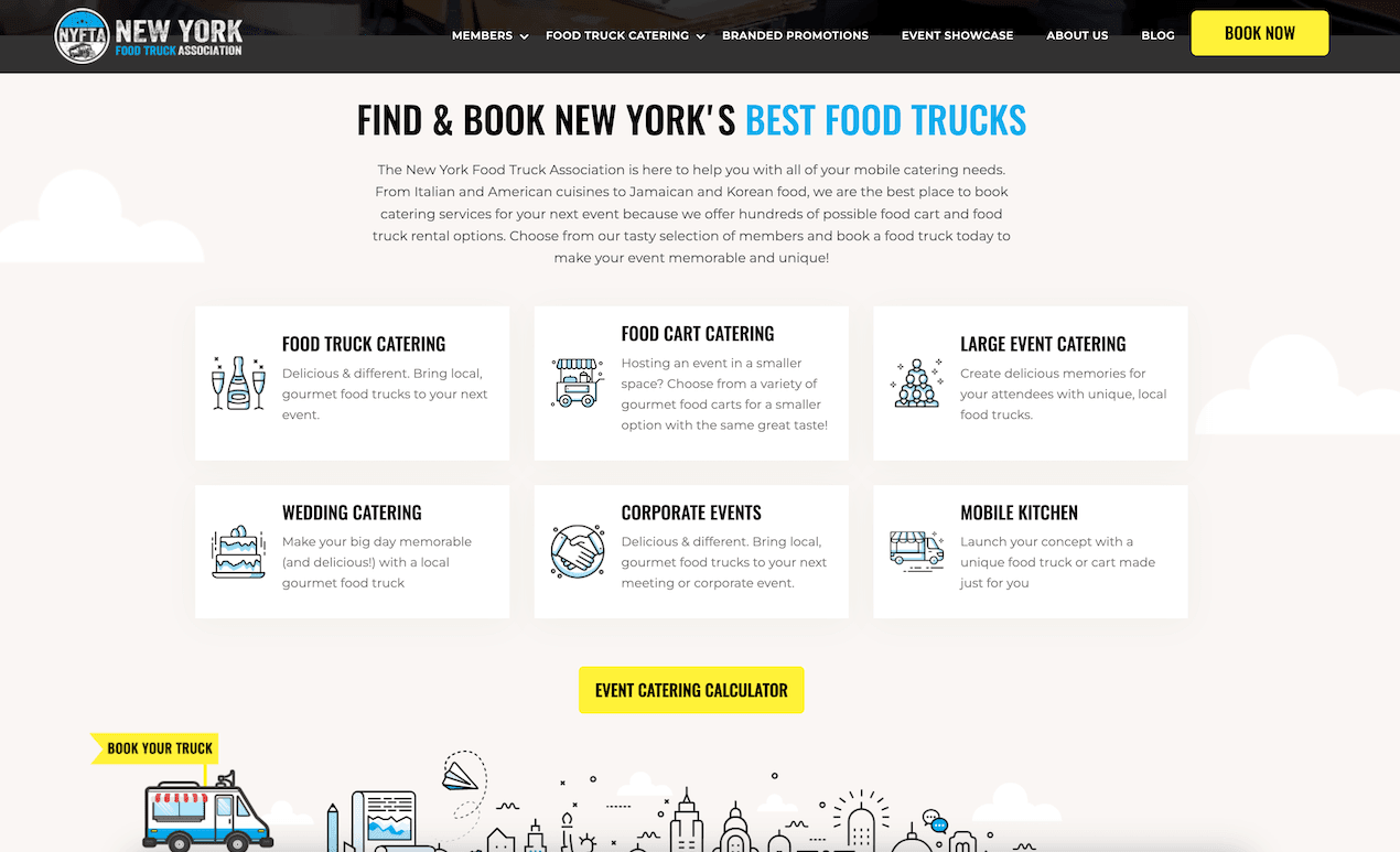

NYFTA
The New York Food Truck Association (NYFTA) is a really awesome organization dedicated to food truck culture and community in New York. When they approached us to design their new site we were happy to work with an organization that we had such admiration for. We wanted to see them succeed and got to work creating a site that would not only get the word out, but also help them grow. Our priorities were user experience and search engine optimization (SEO). On both counts, everyone was very happy with the results!

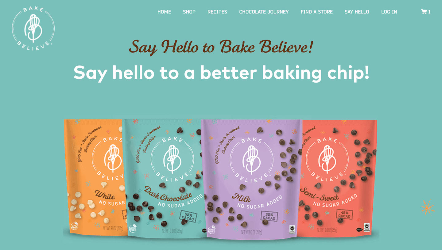

Lets Bake Believe
Following a rebranding, Let’s Bake Believe approached us to create their new site. Makers of no-sugar-added chocolate chips, they knew that the success of their product rested partly on how appealing the branding and website was. We had some functionality tasks: to create a site that enabled visitors to find the products at local grocers, or to order the products directly through ecommerce offered on the site. But we also knew that the success of the site rested on how delicious the products appeared–we wanted the site to make us almost be able to taste the no-sugar-added chocolate!

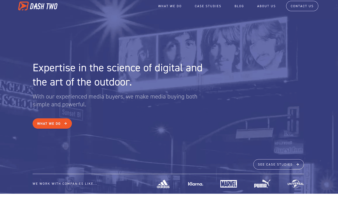

DashTwo
When the advertising and media company DashTwo got in touch with us to design and develop a new site, we knew that it would be a fun and dynamic process. We had seen some of the ad campaigns they had engineered over the years, and we knew their website would have to be just as impressive and memorable as their creative work. The result is a site that we are very proud of from a design perspective, featuring a dynamic and active blog, and an impressive homepage.

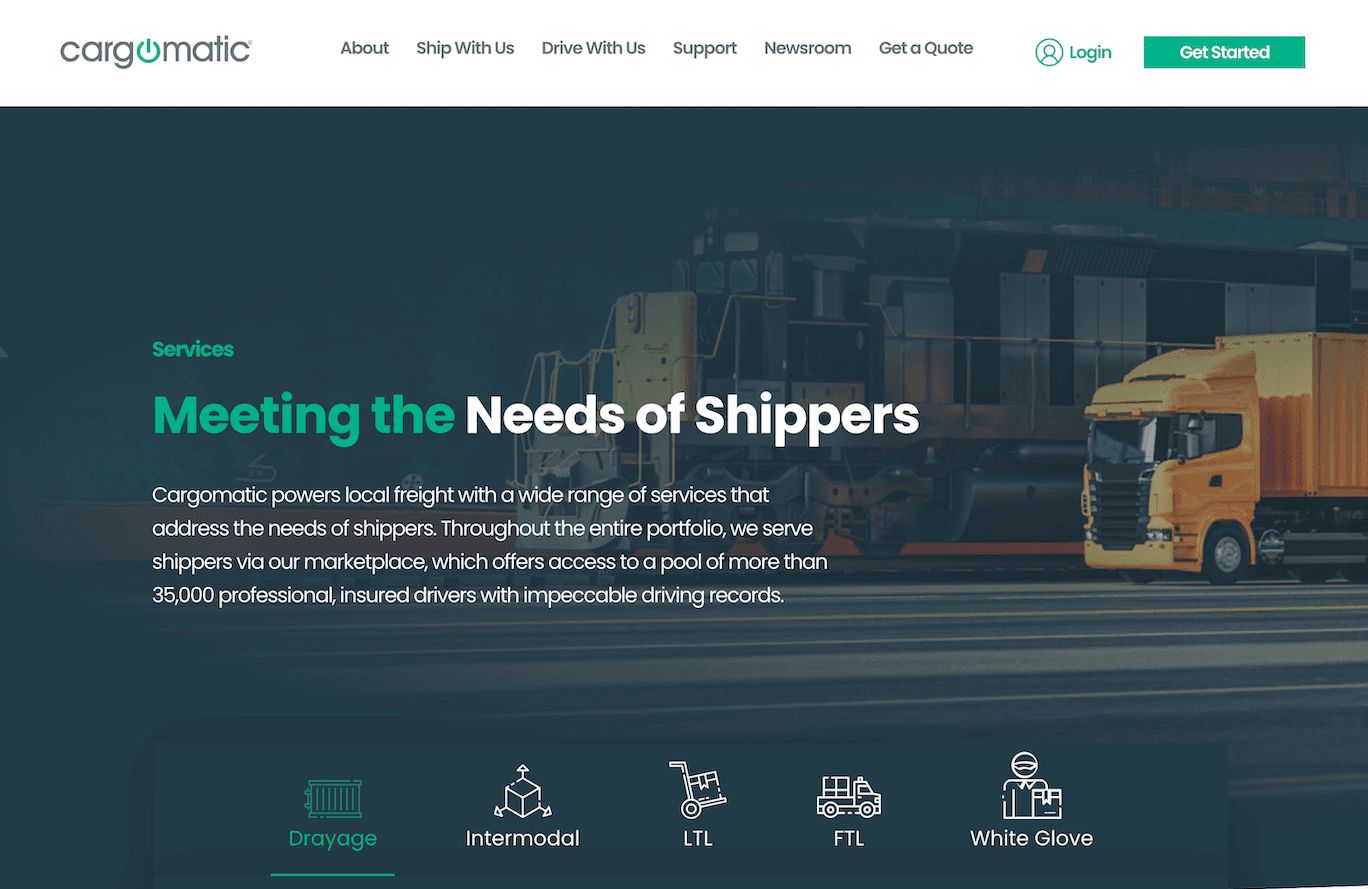

Cargomatic
Cargomatic is an exciting, innovative supply-chain and logistics company that is revolutionizing the way that local and national companies ship their products. When they approached us to create their website, we jumped at the opportunity, seeing that the company had a lot of room to grow and had come up with an innovative solution to an old problem. Their app and API was enabling a more seamless relationship between freight movers and companies, and we wanted to be the web designers to help them tell that story.
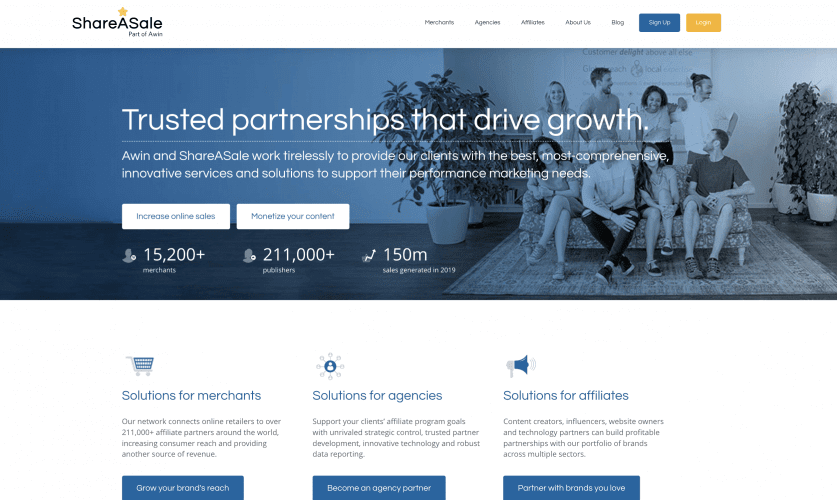

ShareASale
With over $150 Million in sales generated in 2019, ShareASale helps connect online retailers with merchants so you can sell nearly anything you want online! Check out the cool features on their new site!

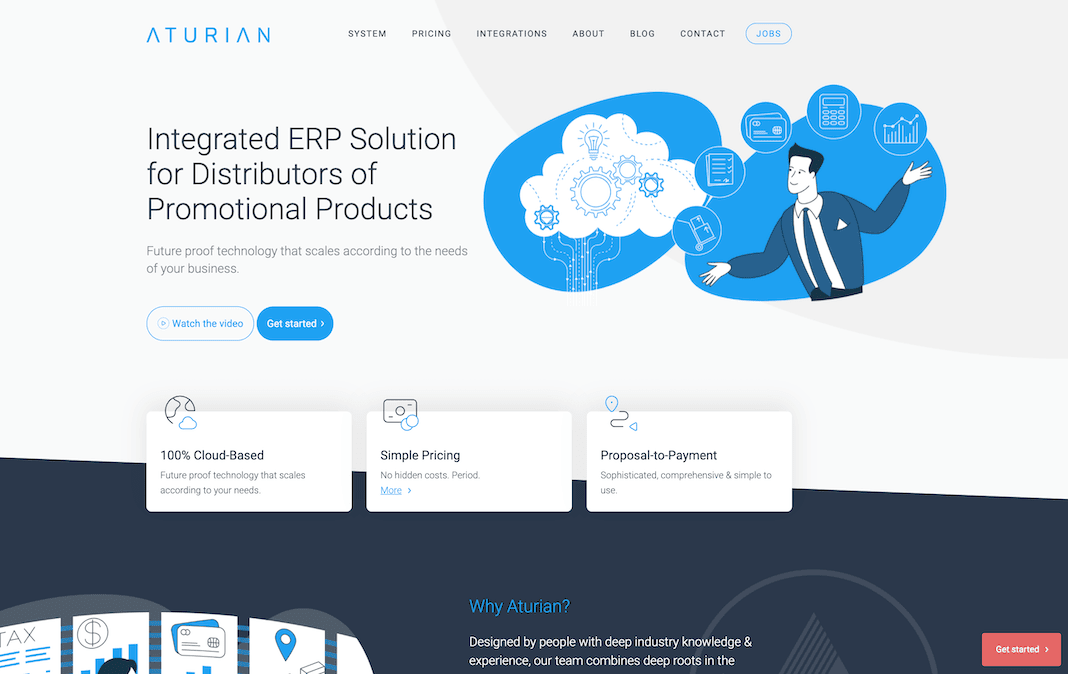

Aturian
Aturian has a simple and powerful out-of-the-box ERP software! We had a blast designing and developing their new site!

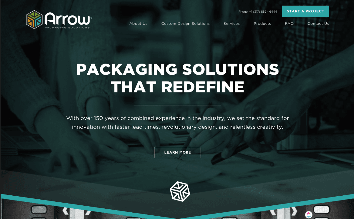

Arrow Packaging
Full-service packaging experts that exceed your expectations!
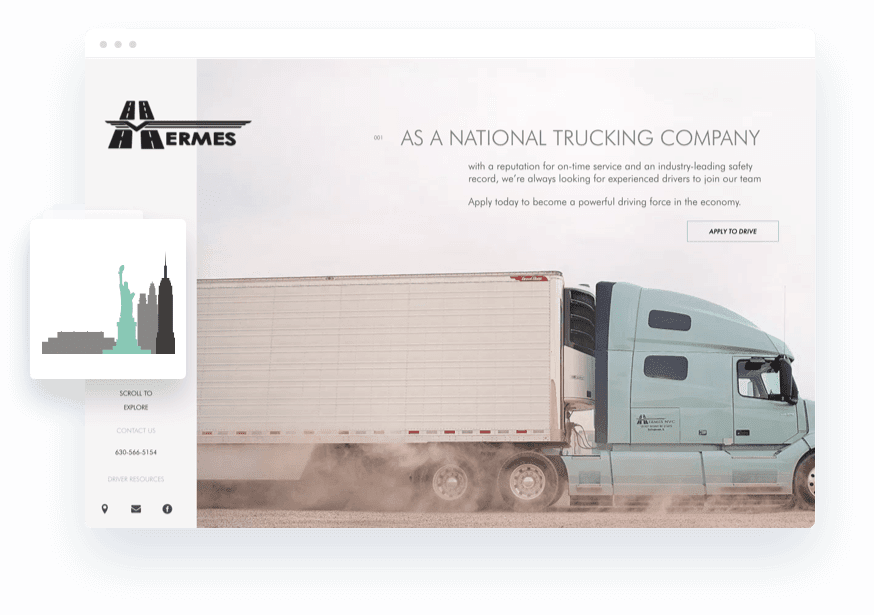

Hermes
This national trucking company is your partner on the road! Known for its exceptional service and on-time deliveries, Hermes won’t let you down!


