We were really happy when Cargomatic got in touch with us to design and develop their new website.
Overview
Learning about their business, we were excited to see the kind of advancements they were bringing to the supply chain, using an app that could connect carriers and shippers in new and innovative ways. We were happy to get involved.
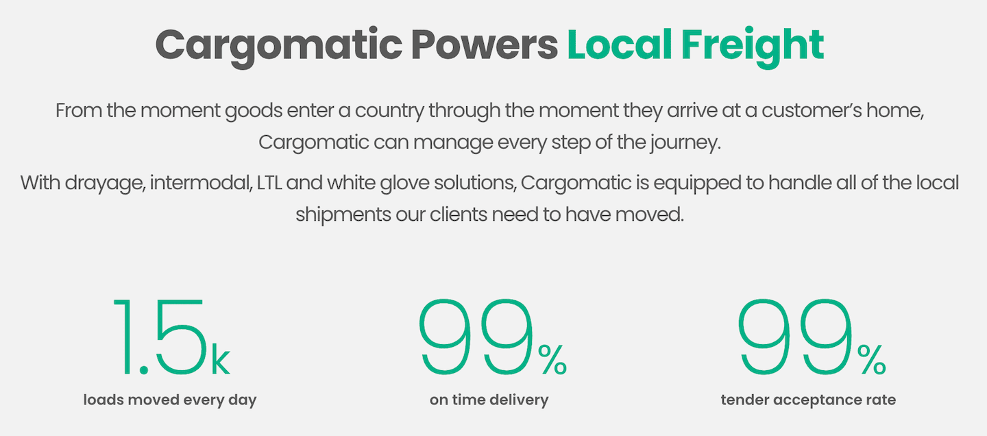
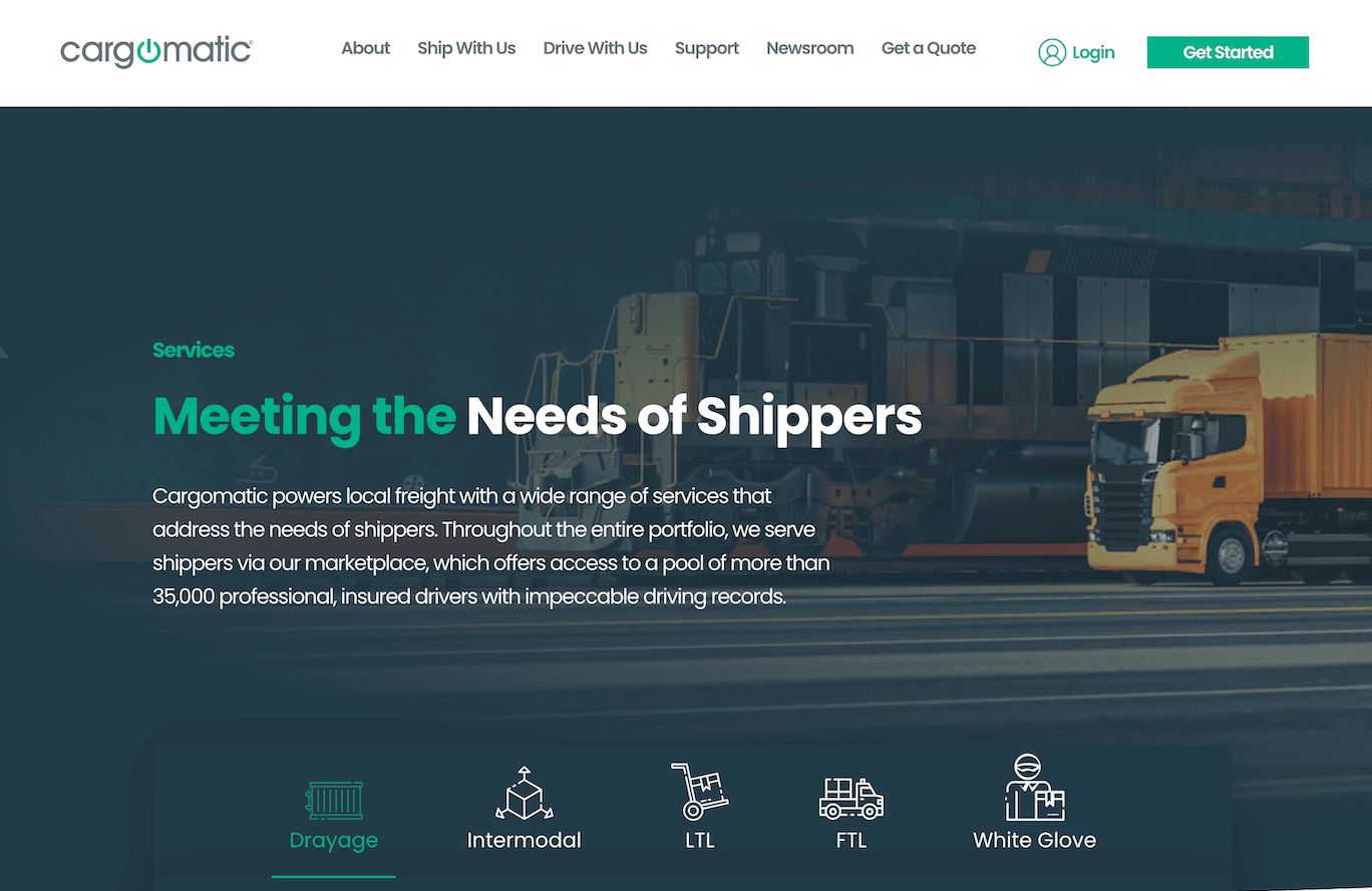
We wanted to create a site that reflected the efficiency and reliability of their app, all while making a straight-foward business case for using their services. With our design, we wanted to capture the industrial feel of the shipping industry and combine it with the Web 2.0 feel of a supply chain app.
Here’s how we did it…
Key Aspects
Images of the App Featured Prominently
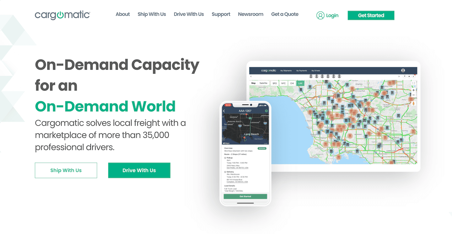
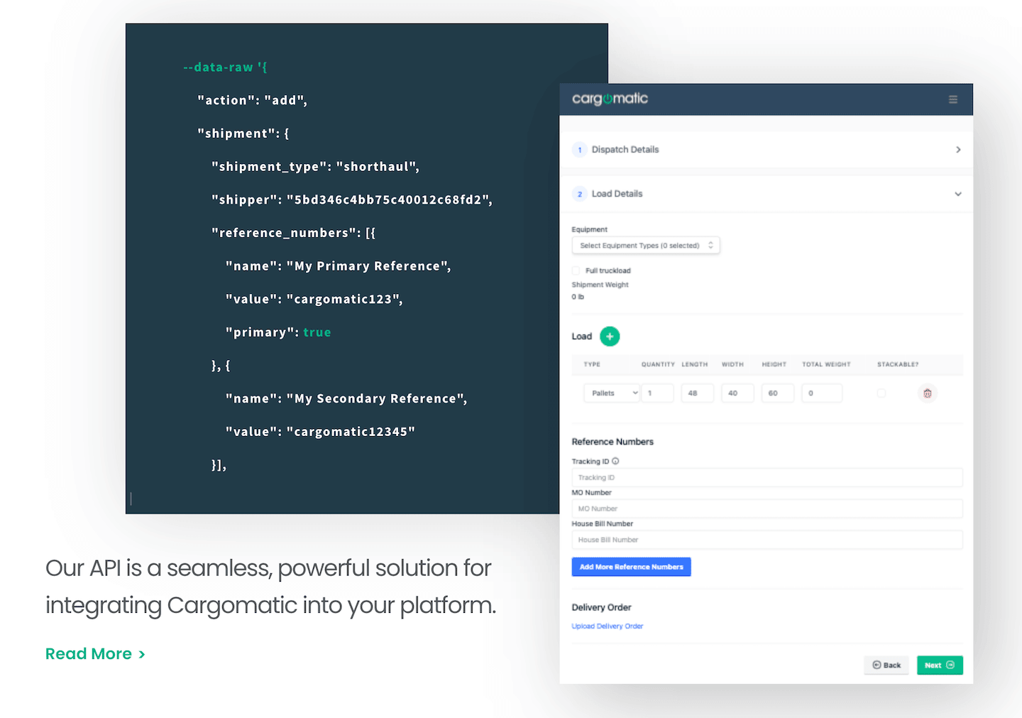
We decided that if they primarily wanted to use the website as a gateway to the app, then the app should be shown on the home page. We made sure to include images of the app screens, and also images that emphasize the coding of the API. This way, it would be very clear in a glance that visitors can download the app to get started.
Lightning Fast
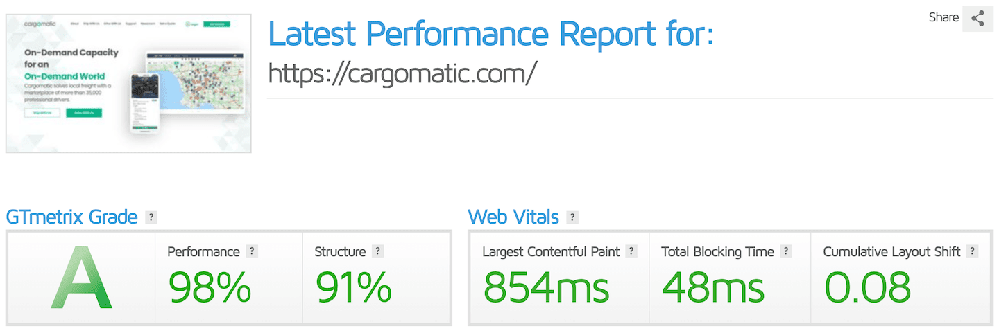
We knew that the business case for the app would depend on a good user experience on the website. If the website wasn’t lightning fast, then many customers would not trust the company enough to use the app. So we did everything we could to ensure a lightning fast experience.
A Back-End Designed For Easy & Versatile Updates
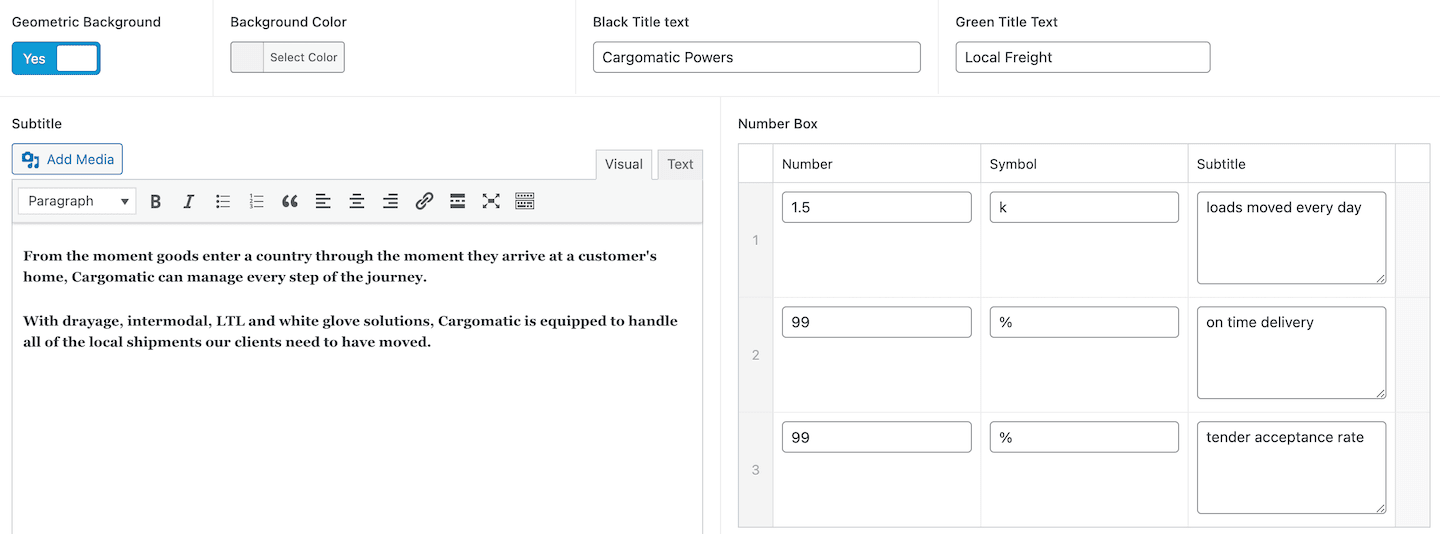
As Cargomatic is a growing company, we knew that their website would need to be updated regularly, as their product offering grew, and they developed more sales content. So we worked closely with the company to create a back-end to the website that would make it easy for them to add content, new pages, new modules, and regular articles. We’ve been delighted to see the website grow and change since our work on it.

I can't say enough about the work Jim completed for us. The website itself is amazing, but the back end customizations enable the company to manage most of the changes we'll want to see over time (he built us an amazing site that we can maintain moving forward). 

Takeaways
Given that Cargomatic’s most potent business case is for its software and app, we knew that we had to make a website that demonstrated efficiency, speed, and user-experience. A website stands in for the company’s service offering, and we wanted visitors to have a seamless, fast, and easy-to-navigate experience on the website. The feedback we’ve received from the client has told us we did something right, because the website seems to be a big part of why the business is growing so rapidly.


